Visualization with FalcomPlot
Goal of this page
A tour of every FalcomPlot helper — static partition plots, chain animation, convergence diagnostics, boundary-frequency maps, interactive Leaflet maps, and the step-by-step JS chain viewer.
FalcomPlot is the FalCom family’s visualization library. Everything the FalcomChain docs draw comes from it; this page collects the full surface in one place so the other pages can stay focused on their own topics.
pip install "falcomplot @ git+https://github.com/kirtisoglu/FalcomPlot.git@main"
The API has four groups:
Group |
Functions |
|---|---|
Grid & partition plots |
|
Convergence diagnostics |
|
Ensemble maps |
|
Interactive |
|
Setup: a chain worth plotting
We run one 300-step chain on the shared demo grid and keep the snapshots. (See Running a FalCom Chain for what each piece means.)
300 snapshots collected
plot_grid — the raw instance
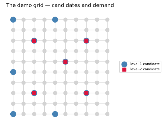
plot_grid draws the graph itself: demand shading, level-1 candidates
(blue circles), level-2 candidates (red squares), plus optional overlays
for artificial candidates and level-2 facility rings. Use it before
any chain runs, to sanity-check the instance.
from falcomplot import plot_grid

plot_grid(graph, title="The demo grid — candidates and demand");
Overlays used elsewhere in the docs:
artificial_candidates=added— orange squares for feasibility repair output.super_centers=state.super_facility.centers.values()— black rings for level-2 facilities.node_colors={node: color}— arbitrary per-node coloring.
plot_partition — one plan, fully annotated
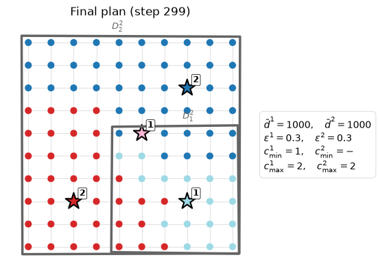
plot_partition accepts a Partition or a ChainState and draws the
full districting: nodes colored by district, black-bordered stars for
each district’s facility center (numbers = team counts), diamonds and
thick boundaries for level-2 super-facilities, and a parameter box
summarizing the regime.
from falcomplot import plot_partition

plot_partition(
    graph, snapshots[-1],
    title=f"Final plan (step {len(snapshots) - 1})",
    demand_target=1000, c_min=1, c_max=2, epsilon=0.3,
    demand_target_super=1000, c_max_super=2, epsilon_super=0.3,
);
Two flags worth knowing:
show_all_candidates=True— draw every candidate site, not just the selected centers (diagnostic view).show_boundaries=True— draw level-1 boundary edges explicitly (off by default, since node colors already encode membership).
animate_chain — watch the chain move
animate_chain builds a matplotlib FuncAnimation over a sequence of
partitions or states; in a notebook, wrap it in HTML(...) for an
embedded player. We subsample to every 10th snapshot to keep the file
small:
from IPython.display import HTML
from falcomplot import animate_chain

anim = animate_chain(
    graph, snapshots[::10], interval=400,
    centers_fn=lambda s: s.facility.centers,
    demand_target=1000, c_min=1, c_max=2, epsilon=0.3,
)
HTML(anim.to_jshtml())
Convergence diagnostics
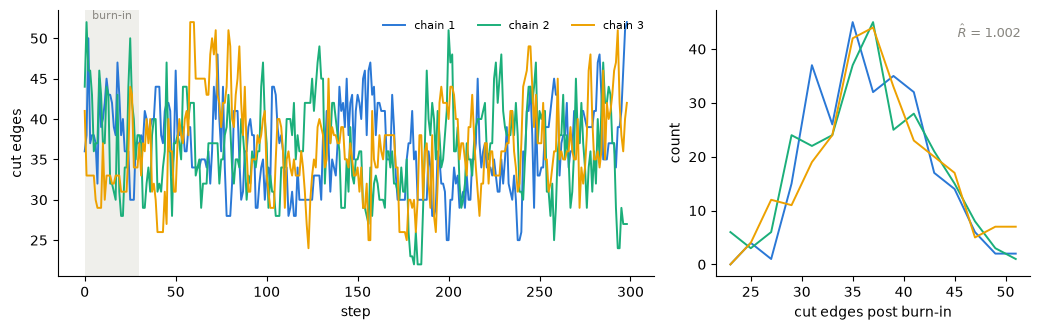
plot_trace overlays scalar traces from one or more chains;
plot_convergence adds post-burn-in distributions and the split
Gelman–Rubin statistic $\hat R$. Both take plain lists of floats, so
you can trace any per-step scalar: cut-edge count, energy, district
count, max covering radius.
import falcomplot as fp

def run_chain(seed, steps=300):
    set_seed(seed)
    p = Partition.from_random_assignment(
        graph=graph, epsilon=0.3, demand_target=seed_demand_target,
        assignment_class=None, capacity_level=2)
    s = ChainState.initial(partition=p, energy=0.0, beta=1.0)
    trace = []
    def record(st, accepted):
        m = st.partition.assignment.mapping
        trace.append(sum(1 for u, v in graph.edges() if m[u] != m[v]))
    list(MarkovChain(
        proposal=partial(hierarchical_recom, epsilon_base=0.3,
                         epsilon_super=0.3, demand_target=1000),
        constraints=lambda p: True, accept=always_accept,
        initial_state=s, total_steps=steps, callbacks=[record]))
    return trace

traces = [run_chain(seed) for seed in (1, 2, 3)]
burn_in = 30

fig = fp.plot_convergence(
    traces, burn_in=burn_in, value_label="cut edges",
    labels=[f"chain {i}" for i in (1, 2, 3)],
)
The scalar summaries behind the plot are available directly:
rhat = fp.gelman_rubin([t[burn_in:] for t in traces])
ess = sum(fp.effective_sample_size(t[burn_in:]) for t in traces)
print(f"R-hat = {rhat:.3f}   total ESS = {ess:.0f}")
R-hat = 1.002 total ESS = 95
$\hat R$ close to 1 means independently seeded chains agree; ESS is the number of effectively independent draws the correlated runs provide. Ensemble Analysis shows these diagnostics on the real London Ambulance instance.
Boundary-frequency maps
cut_frequencies counts how often each edge separates districts across
a set of sampled assignments; plot_boundary_frequency renders the
result. Dark edges are robust boundaries (drawn the same way in nearly
every sample), pale edges are fragile.
assignments = [s.partition.assignment.mapping for s in snapshots[30:]]
edges = [(min(u, v), max(u, v)) for u, v in graph.edges()]
freqs = fp.cut_frequencies(edges, assignments)  # per-edge, aligned with `edges`

pos = {n: (d["C_X"], d["C_Y"]) for n, d in graph.nodes(data=True)}
fig = fp.plot_boundary_frequency(
    edges, freqs, pos,
    aspect="equal", floor=0.0,
    colorbar_label="boundary frequency",
    title="Which boundaries does the ensemble agree on?",
)
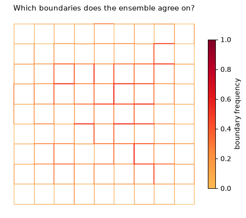
The robust boundaries lie between the five high-demand city centers — the chain separates cities however it starts. Interior rural boundaries stay pale because many draws are equally good. This map is the core output of Ensemble Analysis.
Interactive Leaflet maps
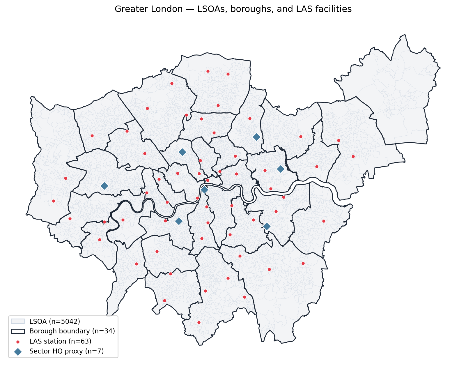
For real geographic instances, falcomplot.mapping.plott builds
tiled Leaflet maps: a basemap clipped to your study region, dissolved
administrative overlays, and categorized point markers with tooltips.
from falcomplot.mapping import plott

m = plott.build_basemap(boundary=lsoa_gdf, center=(51.5, -0.12), zoom=10)
plott.add_hierarchy(
    m, hierarchy="borough", basemap_gdf=lsoa_gdf,
    color="#222", weight=1.6, fill_color="#fed8b1", fill_opacity=0.18,
    tooltip_fields=["borough"],
)
plott.add_markers(m, stations_gdf, categories={
    "LAS station": {"color": "#e63946", "radius": 5, "order": 0},
    "Emergency Operations Centre": {"color": "#1d3557", "radius": 8, "order": 1},
})
m.save("overview.html")
This is exactly how the London overview figure in the case study is produced:
The interactive JS chain viewer
For step-by-step forensics — which subtree was cut, what the ψ scores were, why a proposal was rejected — FalcomPlot ships a Canvas-based viewer that replays a recorded chain with district and spanning-tree modes.
Tip
Try it in the browser first — a hosted instance with pre-recorded demo and London Ambulance Service trajectories runs at akirtisoglu.me/research/falcom/dashboard. No install needed; the steps below are for replaying your own runs.
Record the chain with FalcomChain’s Recorder, export, and serve:
from falcomchain.tree.snapshot import Recorder

recorder = Recorder("output/", record_substeps=True)
recorder.write_header(graph, partition, params={"epsilon": 0.3, "demand_target": 1000})

chain = MarkovChain(..., recorder=recorder)
for state in chain:
    pass
recorder.close()

Recorder.export_to_json("output/", "output/json/")

import falcomplot as fp
fp.animate("output/json/")     # starts a local server and opens the viewer
The viewer shows district assignments with facility candidates (gold stars), the spanning tree with root and cut nodes, and a metadata sidebar (step number, energy, acceptance, ψ scores, admissible cut count).
Where to go next
Running a FalCom Chain — the mechanics behind the snapshots used here.
Ensemble Analysis — the statistics these plots render.
Case Study: London Ambulance Service — the plots on a real instance.